Use the heat map to visualize and analyze the illustrated congestion result of the design.
The heat map shows the levels of congestion in different colors.
- Cold colors, such as blue and green, indicate areas that are less congested.
- Warmer colors, such as yellow, orange, and red, indicate areas that are highly congested.
- Hot colors, such as purple and white, indicate areas of over-congestion.
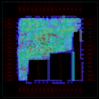
The figure shows the congestion results displayed in the heat map.