Using histogram in the Congestion Analysis assistant, you can view and analyze the instant feedback and the level of congestion in a design. It is used for two purposes:
- To display the color palette for the heat map.
- To display the congestion curve in the design.
The length of the bar in each percentage range represents the number of global cells (as a proportion of the entire design) that have a particular level of congestion.
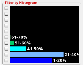
In the example above, most of the gcells are in the 1-20% and 21-40% ranges, therefore, the design can be considered less congested from a routing perspective as there are lots of available tracks throughout the design.