Sources and Sinks Map
The net connectivity provides information about the components that can be connected but not about the order in which they should be connected. The sources and sinks map representation and visualization helps in determining this order to create a net topology that is EM compliant.
Use the Display Sources and Sinks map ![]() button on SDR Toolbar to:
button on SDR Toolbar to:
- represent the current distribution as a thermal map by using color code.
- identify the individual pins or clusters that are the biggest current producers and consumers.
- view the estimated current value that is displayed on the screen over the devices or clusters.
- determine the connection style.
- identify the best net topology by connecting the major producers with fat wires to carry the current and then add small current producers.
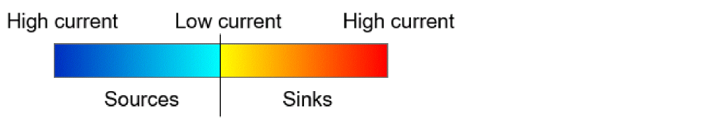
The color code for the sources and sinks map is defined according to the current distribution. The color code uses the two gradients of three colors each, one for sources and the other for sinks.
- Red is for a sink with a high current (66% to 100%).
- Orange is for a sink with a medium current (33% to 66%).
- Yellow is for a sink with a low current (0% to 33%).
- Dark blue is for a source with a high current (66% to 100%).
- Blue is for a source with a medium current (33% to 66%).
-
Cyan is for a source with a low current (0% to 33%)
Related Topics
Visualizing the Current Distribution Per Net
Return to top