Congestion Visualization
Once global routing and congestion analysis is run, there are various methods to view congestion in your design. Following are the methods to view congestion in your design.
View the Heat Map
The heat map is a standard method to visualize congestion. After global routing and congestion analysis is complete, the heat map is updated to illustrate the congestion result in the main window.
You can use the heat map to visualize and analyze congestion in your design. The heat map shows the level of congestion in different colors. The indication of the different color codes is as given below.
- Cold colors, such as Blue and Green indicate less congestion.
- Warmer colors, such as Yellow, Orange, and Red indicate high congestion.
- Hot colors, such as Purple and white indicate over congestion.
The following figure shows the congestion result in the heat map.
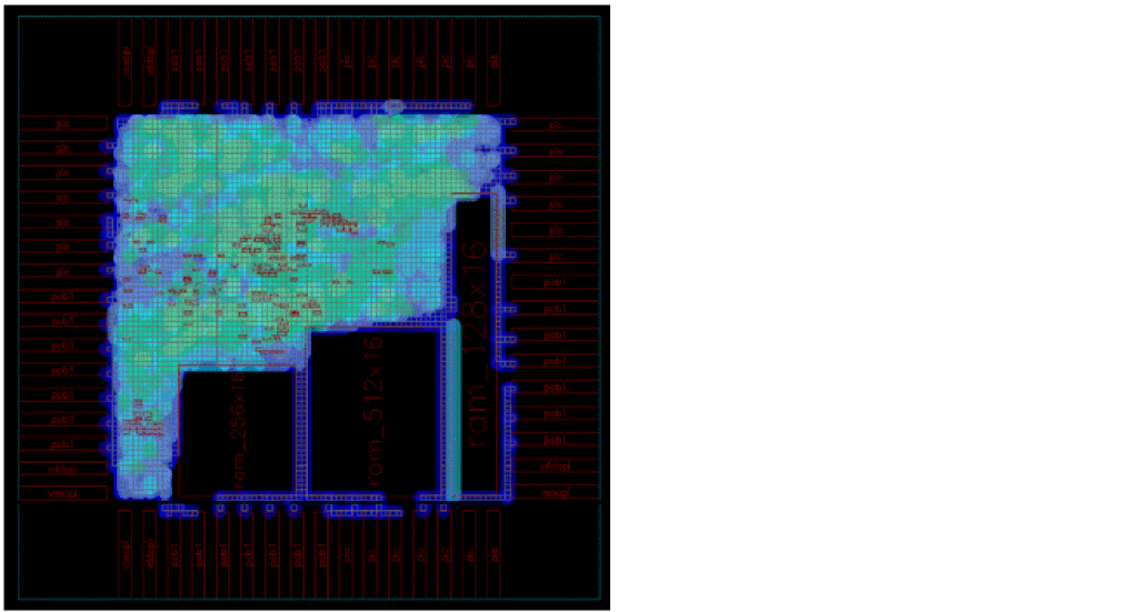
Since the colors displayed in the heat map are mostly blue and green in color, it indicates that the design is less congested.
View the Histogram
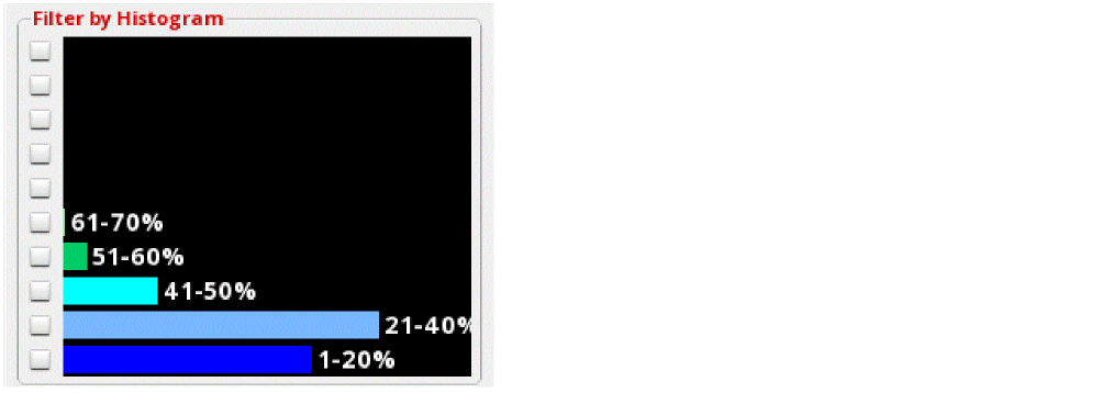
Another method to view and analyze congestion in your design is using the histogram section in the Congestion Analysis assistant. The histogram provides instant feedback and displays the amount of congestion in a design. It is used for two purposes:
- Display the color palette for the heat map.
-
Display the congestion curve in the design.
The length of the color bar in each percentage bucket represents the number of global cells (as a ratio of the entire design) that have a particular level of congestion.
The following figure shows an example of a design that is less congested. Most of the gcells are present in the 1-20% and 21-40% buckets. Therefore, there are lots of available tracks throughout the design.
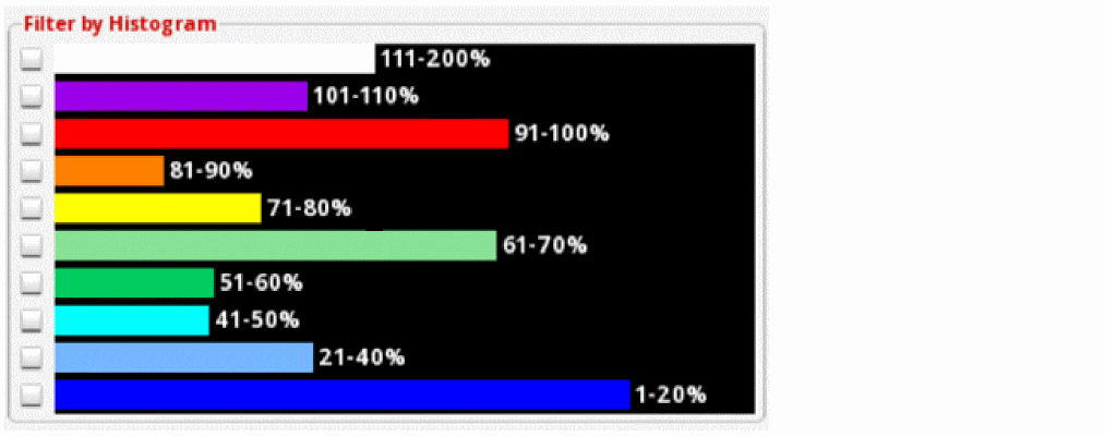
Here is another example that shows the over-congested design. Most of the gcells are contained in the upper buckets, which means that less routing resources are available.
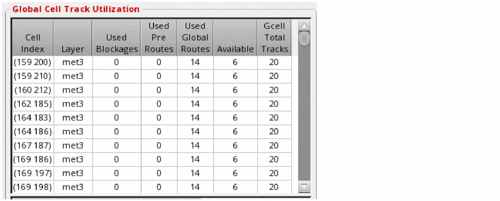
View the Global Cell Track Utilization Table
When global routing and congestion analysis is run, the global cell track utilization table is populated with the capacity and availability information of every gcell in the design. It is an effective and informative arrangement to quickly view the gcell information.
- Horizontal congestion for the track utilization table is calculated using the track capacity and track availability data along the LEFT edge of a gcell.
- Vertical congestion for the track utilization table is calculated using the track capacity and track availability data along the BOTTOM edge of a gcell.
The following figure displays how the information is displayed in the Global Cell Track Utilization table.
Related Topics
Running Global Routing and Congestion Analysis
Return to top