Results Based on Histogram Customization
The congestion data result is created and displayed based on the histogram customization. Let us see how the results of congestion data differs in three different methods of histogram customization.
Customized as Interval
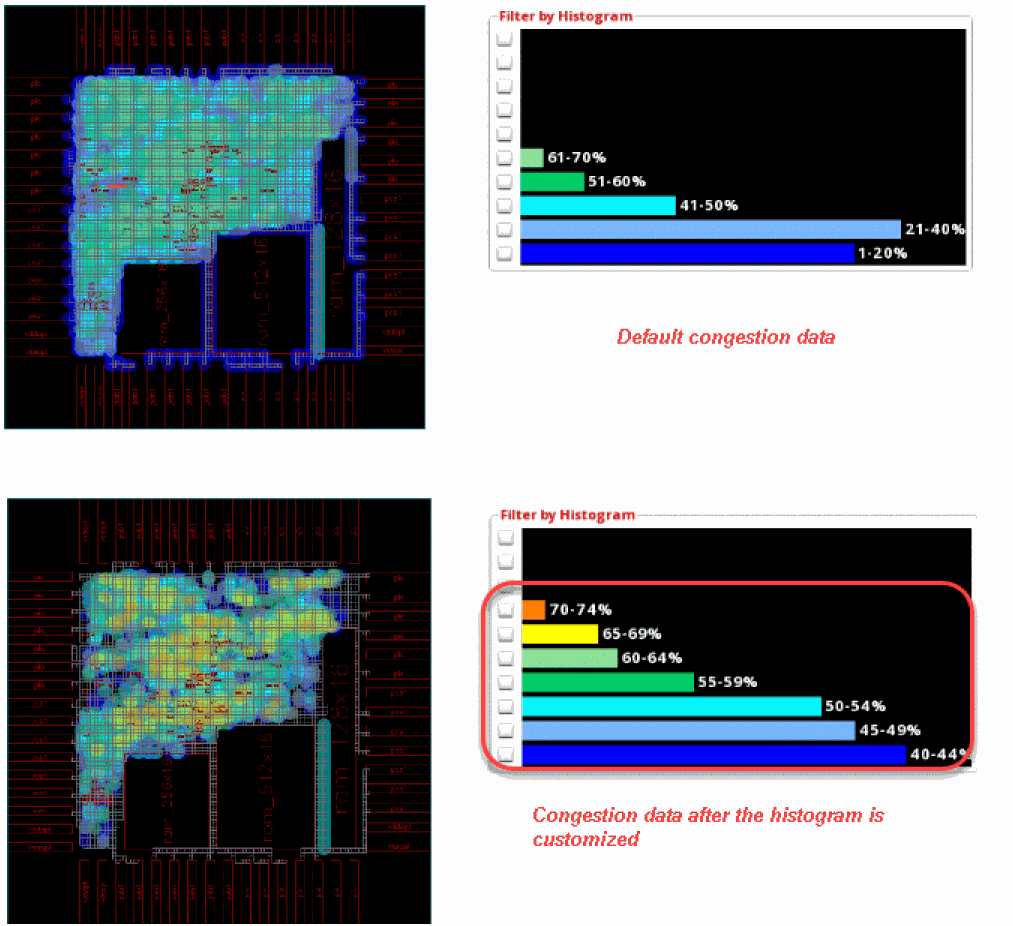
The Interval option in the Congestion Histogram Customize form lets you specify the congestion percentage to start and the interval between the congestion buckets.
The following figure shows an example where the histogram starts at the 40% value with an interval of 5% in each bucket. The histogram is updated to only display congestion data for the upper buckets. As can be seen, most of the congestion is in the 40-44% bucket.
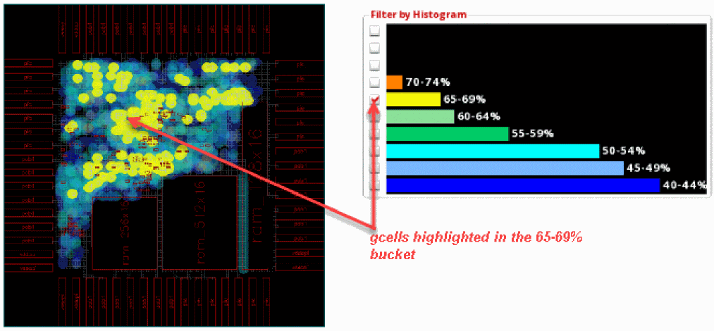
Now, click the check box next to the 65-69% bucket. The gcells in this bucket are highlighted in the heat map and the global cell track utilization table.
Customized as Start and End
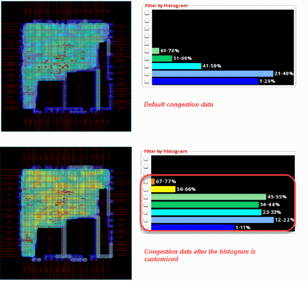
The Start and End option in the Congestion Histogram Customize form lets you specify the congestion percentage to start and the congestion percentage to end. The intervals between congestion buckets are derived automatically.
The following figure shows an example where the percentage to start is specified as 1% and the percentage to end is specified as 110%. The interval for each bucket is automatically set to 10%. The histogram is updated to only display congestion data for the specified buckets that were selected in the customization form. As can be seen, most of the congestion is in the 12-22% bucket.
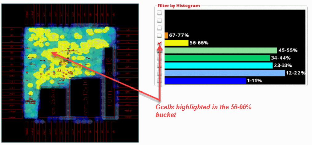
Now, click the check box next to the 56-66% bucket. The gcells in this bucket are highlighted in the heat map and the global cell track utilization table.
Customized as Specified
The Specified option in the Congestion Histogram Customize form lets you specify the exact congestion percentage. The start percentage for each bucket has to be individually specified.
The following figure shows an example where the percentage to start the histogram is specified as 9%, the next congestion bucket starts at 19%, the one after that at 29%, and so on.
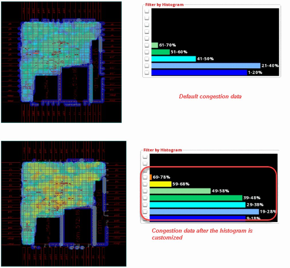
The congestion between 9-99% is now visible in the histogram. As can be seen, most of the congestion is in the 19-28% bucket. Also, there is hidden congestion in the 117-200% bucket.
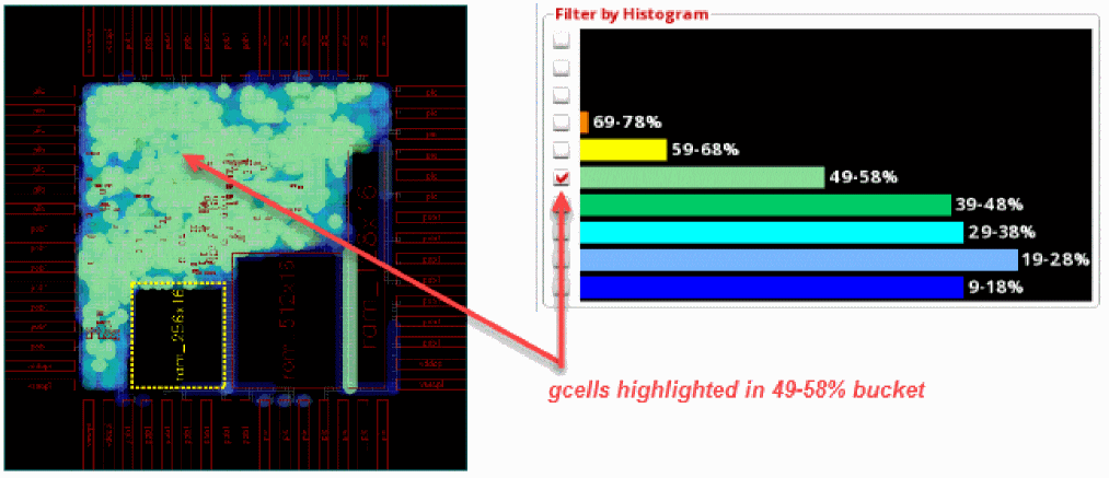
Now, click the check box next to the 49-58% bucket to highlight the congested hot spots on the heat map and debug why the gcells are so congested by reviewing the global cell track utilization table.
Related Topics
Congestion Histogram Customize Form
Return to top