show_congestion
show_congestion
[ -cells [ true | false ] ]
[ -edges [ true | false ] ]
[ -off ]
Description
Shows a pictorial representation of the amount of resources used by the router as determined by congestion_analysis. Each gcell is associated with a congestion score that represents the estimation of how congested that gcell is. By default, both cell and edge gcell representations are included.
If the gcell preferred layer direction is horizontal, the congestion score is represented by a vertical bar in the middle of the gcell. A thick bar corresponds to the area-type cell gcell, while a thin bar corresponds to an edge gcell. If the gcell preferred layer direction is vertical, the congestion score is represented by horizontal bars.
Each layer can be displayed independently. If several layers are displayed simultaneously, gcells having the same preferred layer direction are combined into a single score. If gcells are combined, the worst-case congestion percentage will be shown.
The congestion score is converted to colors using the following table:
| % Congestion | Color |
|---|---|
Arguments
Examples
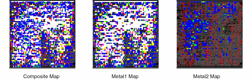
The following figures show congestion maps for a design. All layers are represented in the composite map. The other two maps isolate the congestion for Metal1 and Metal2, which are the only layers used for routing signals. The maps show that Metal1 contributes to the majority of the congestion, and areas colored white are the most severely congested.
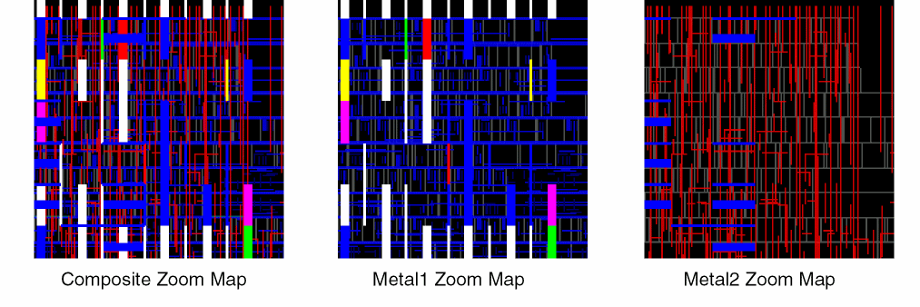
Zooming in to the upper-right corner of the design results in the following congestion maps. The closer view helps you to identify problem areas. In this example, Metal1 wires are blue, and Metal2 wires are red. Since the preferred direction for Metal1 is horizontal, the congestion bars for Metal1 are vertical. The thick bars represent congestion within gcells, while thin bars represent congestion between gcells. The preferred direction for Metal2 is vertical, so horizontal bars represent congestion for Metal2. In the Metal2 Zoom Map, the right half of the area has congestion under 70% and no congestion bars are drawn. The left side of the Metal2 Zoom Map has some blue horizontal bars, both thick and thin, that identify gcells and edge gcells, respectively, with congestion between 70 and 80%.
Related Topics
Return to top