6
Custom Digital Placer Forms
This section lists the controls in the Virtuoso® custom digital placer forms.
- Auto Placer
- Choose Types
- Dressing Template Editor
- Pin Placement
- Placement Planning
- Swap Tap Cells
- Insert/Delete Filler Cells Form
- Placement Status
Auto Placer
Use the Auto Placer form to define the type of placement to be run, the technology rules to be used, any automatic spacing adjustments to be done, and how the modified cellview is saved.
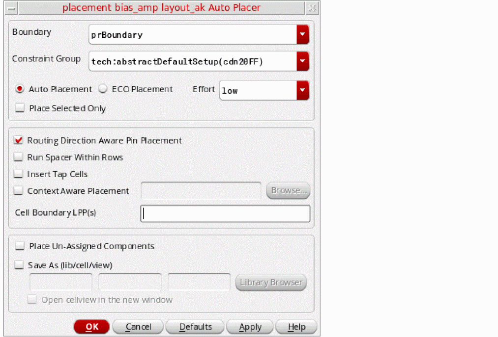
Boundary provides a list of available boundaries in the current design. Choose the boundary to be considered for placement.
Constraint Group lets you choose the constraint group containing the placement rules for the current technology.
Auto Placement places components without taking into consideration any initial placement. You would typically use this option the first time you place a design or to discard previous unsatisfactory placement results.
ECO Placement places all unplaced components based on their connectivity with the placed components.
Effort lets you choose from the Low, Medium, and High effort levels. The run time of the placer and quality of results differ based on the effort chosen. The time for each effort level increases in roughly linear increments.
Place Selected Only places only the objects currently selected in the design. When deselected, all the objects in the design are placed.
Routing Direction Aware Pin Placement considers the routing direction of layers while pla cing unconstrained pins. For example, if M2 has a preferred routing direction as horizontal, then pins on M2 are placed on the left and right edges.
Run Spacer Within Rows distributes components evenly in the rows.
Insert Tap Cells inserts tap cells (standard cell substrate contacts) in the empty spaces between the standard cells in a row based on the specified minimum and maximum contact spacing value.
Environment Variable: insertSubstrateContacts
Context Aware Placement specifies that the placement of standard cells should be such that each cell is aware of the context of the neighboring cell and supports placement in accordance with the LEF58_EDGETYPE and LEF58_CELLEDGESPACINGTABLE LEF5.8 constraints that are either defined in the technology and macro LEF or provided using an XML file. Click Browse to select a context file, which is an XML file containing edge spacing constraint information for performing context-aware placement.
For more information, see Context-Aware Placement.
By default, the Context Aware Placement option is OFF.
Environment variables: contextAwarePlacement, contextConstraintFile
Cell Boundary LPP(s) specifies the layer-purpose pairs (LPPs) that the placer uses to derive the cell boundary for standard cells.
Environment variable: vcpCellBoundaryLPPs
Place Un-Assigned Components allows floating components to be moved when using the Assisted Mixed CMOS/Standard Cell placement mode.
Save As lets you specify a new Library , Cell , and View name for the placed cellview. By default, the placed cellview is saved under the current cellview name. Click Library Browser to choose a different name.
Open cellview in the new window displays the placed view in a new window after placement if it is not already displayed. Otherwise, the system updates the output view in the existing session window.
Related Topics
Choose Types
Use the Choose Filler Component Types form to choose the component type to which filler cells (or standard cell substrate contacts) are assigned.
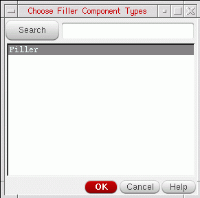
Search scrolls the list to the component type name you type into the field. The name must match.
Related Topics
Dressing Template Editor
Use the
Dressing Template Editor
to define the rails and allowed component types for a specific custom placement area. You access it by clicking the button with the same name on the
The form is split into two tabs.
Related Topics
Rail Definition Tab
Use the Rail Definition tab to define the rails for a custom placement area.
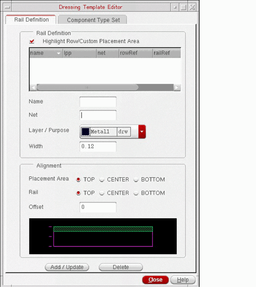
Rail Definition lets you set the basic attributes of a rail; its Name, the Net to which it is attached, the Layer/Purpose pair on which it is drawn, and its Width. If you select the Highlight Row/Custom Placement Area check box and then select one or more rail definitions, then the corresponding rows that use the selected definitions are highlighted in the layout canvas. Alternatively, use environment variable highlightRowFromDTE.
Alignment lets you specify the position of the rail in a custom placement area. The picture at the bottom of the form lets you visualize the selected alignment.
Placement Area specifies whether the rail is to be aligned with the TOP, CENTER, or BOTTOM of the custom placement area.
Rail specifies which part of the rail is used as the reference point for the alignment; its TOP edge, CENTER line, or BOTTOM edge.
Offset defines an offset from the specified alignment. This lets you leave a channel around the edge of the custom placement area, or align the rail slightly off-center. Both, positive and negative offset values are honored.
When you are done, click Add/Update to add to add the rail definition to the list at the top of the form and to the Predefined list in the Create Custom Placement Area form.
Use Delete to remove a selected rail definition from the list.
Related Topics
Component Type Set Tab
Use this Component Type Set tab to specify the component types that can be placed in a custom placement area.
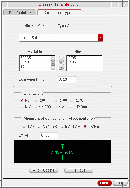
Allowed Component Type Set lets you create a component type set and specify which of the component types defined in your design can be placed in it.
The combo-box at the top of the form lets you define the name for the component type set.
Available lists all the component types defined in the current design. Use the right arrow button to move a selected component type into the Allowed list.
Allowed lists the component types allowed in the current component type set. Use the left arrow button to move a selected component type into the Available list.
Component Pitch specifies the minimum spacing between individual components placed in the custom placement area.
Orientations specifies how components can be flipped and rotated by the placer’s Allow Rotation option. Check the orientations you want to allow. Orientations specified here are relative to the custom placement area.
Alignment of Component in Placement Area specifies how components are aligned in the custom placement area; TOP, CENTER, BOTTOM, or NONE. The picture at the bottom of the form lets you visualize the selected alignment.
Offset defines an offset from the specified alignment. This lets you leave a channel around the edge of the custom placement area, or align the components slightly off-center.
When you are done, click the Add/Update button to add the component type set to the Predefined list in the Create Custom Placement Area form. Use Remove to remove a selected component type set from the list.
Related Topics
Pin Placement
Use the Pin Placement form to:
- Specify pin location constraints and to pre-place pins independently from the main placement run. See Pin Planner for more information.
- Optimize your pins to achieve the shortest possible net lengths at a particular level. See “Pin Optimization” in Virtuoso Floorplanner User Guide.
The Pin Placement form is available from both the Place menu and the Floorplan menu.
- Place – Pin Placement opens the Pin Placement form with the Pin Planner tab at the front.
- Floorplan – Pin Optimization opens the Pin Placement form with the Pin Optimization tab at the front.
Related Topics
Pin Planner
Use the Pin Planner tab to specify how pins are placed in your design.
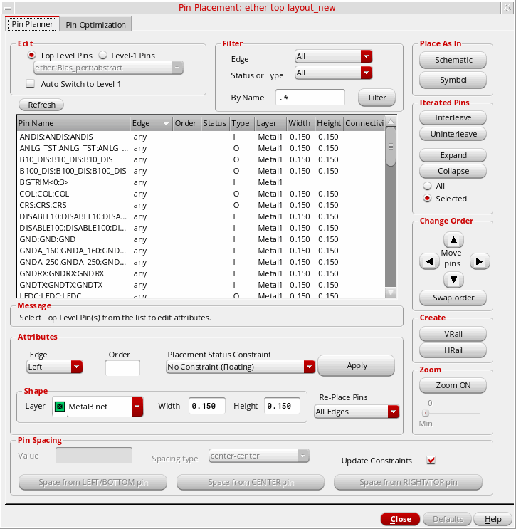
Edit lets you specify the scope of the pin planning.
Top Level Pins applies the settings on the form only to the top-level pins.
Auto-Switch to Level-1 automatically zooms to the selected soft block and switches to Level-1 Pins mode when you click a soft block in the design canvas. This option is off by default, which means that when you click a soft block in Top Level Pins mode, the soft block is selected but you remain at the top level.
Level-1 Pins applies the settings on the form to the pins of a selected soft block in the design. Choose the soft block whose pins you want to place from the drop-down list.
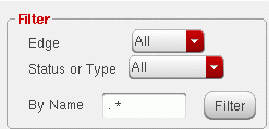
Filter lets you specify the pins that are listed in the form. Use a combination of the two pull-downs to filter the pins that are displayed. Alternatively, you can use the By Name field to filter the pins by name.
Edge lets you filter by the edge to which a pin is assigned. Choose one of All, Left, Top, Right, or Bottom.
Status or Type lets you filter by placement status or pin type. Choose one of All, Placed, Unplaced, Locked, Fixed, Ordered, Unordered, I, O, IO pins.
By Name lets you filter the Top level or Level-1 pins by name. The default regular expression for this filter is “.*” (dot asterisk), which implies that a name filter is not applied. Therefore, all the pins in the design are displayed. Other valid regular expressions are:
- “ ” (Blank) — Is equivalent to the default regular expression and it implies that the name filter is not being applied. Displays all the pins.
- “in.*” — Displays all the pins that have names starting with “in”.
- “.*in.*” — Displays all the pins that contain “in” in their name.
- “.*in” — Displays all the pins that have names ending in “in”.
The “in” in the valid regular expressions above can be replaced with any other expression, such as “VDD”.
The filter string “*.*” is not a valid regular expression. Use a valid regular expression instead.
The By Name field is case-sensitive.
To list all the I/O pins on the left edge of the design, you can set the options, as illustrated below.
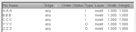
The pin table lists all the shape pins found in the current scope. It does not list pins that are vias. The entries are expressed as termName:pinName:figName because the pin figure is the physical entity that you are placing. If a pin has more than two pin figures attached to it, but the pin figures have the same name, they are represented by a single entry in the pin table.
The other columns in the pin table list the Edge to which the pin is assigned, the Order in which the pins are placed, and the Pitch, Status, Type, Layer, Width, and Height of the pins. You can sort the table by any column by clicking the relevant column header; click again to reverse the sort order.
Use Model for Cross-Selection of Pins
Any pin that you select in the pin table, as shown below, also gets selected in the navigator assistant and the layout canvas, or vice versa.
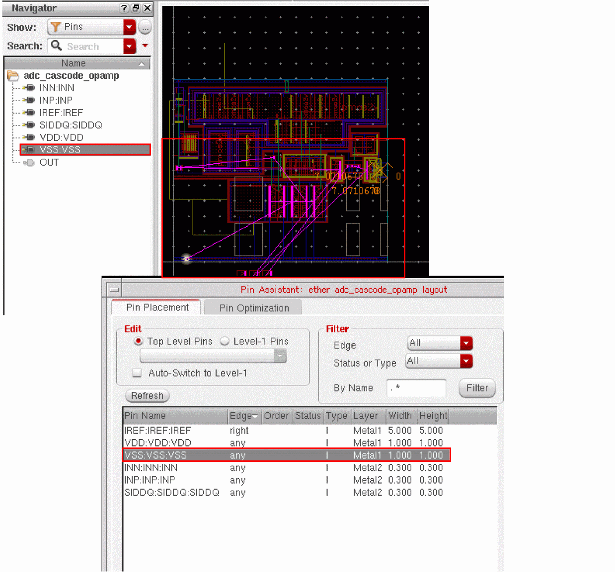
If you select a top-level pin in the layout canvas and the Pin Planner tab has the Top Level Pins edit mode selected, the pin table displays the selected pin as highlighted. However, if the edit mode selected in the Pin Planner tab is Level-1 Pins, the form automatically switches to the Top Level Pins mode to show the cross-selection. The automatic mode switching works as long as the selected layout pins belong to the same level—top or level-1. If you select a mix of top-level and level-1 pins in the layout canvas, the Pin Planner tab continues to be in the current selected mode and displays only those pins as highlighted in the pin table that belong to the current edit mode.
The table below summarizes how the Pin Planner tab handles the cross-selection depending on the layout pins selected. Let us assume here the default edit mode selected is Top Level Pins:
-
To add to your selection set in the pin table, incrementally select the pins using the
CtrlorShiftkey, as appropriate. -
To nullify your existing selection:
- In the pin table, click any pin. This nullifies the previous selection and shows only the clicked pin as selected.
- In the layout canvas, click anywhere. This nullifies the previous selection and shows no pins as selected. However, if you click a pin in the layout canvas, the previous selection is nullified and the clicked pin appears as selected.
Messages provides a hint on your next action.
Attributes lets you specify the attributes and Apply them to the specified pins in the pin table.
Edge specifies the edge on which the pin is to be placed. The options are Left, Top, Right, Bottom, Any, None, and As is. The As is setting leaves the edge settings of pins intact when changing the Order or Placement Status Constraint properties.
Order specifies the order in which the selected pins are to be placed. You can specify an order only if you have assigned the pins in question to an edge.
Placement Status Constraint specifies the status assigned to the pins after they are placed.
Lock at Placed Location places the pin at the appropriate location on the boundary and then locks the pin at that location. A locked pin cannot be moved either by the automatic placement functions or manually by the user.
Fix at Placed Location places the pin at the appropriate location on the boundary and then fixes the pin at that location. A fixed pin cannot be moved by the automatic placement functions; however, you can move it manually, for example, using the Edit – Move command.
No Constraint (Floating) means that the selected pins are neither locked nor fixed after they are placed. A no constraint, floating pin can be moved freely by the automatic placement functions and using manual editing functions.
As is does not change the status of the selected pins after placement. Use this option to preserve differing status settings on the selected pins.
Shape
lets you specify the Width and Height of the pin shape to be generated and the Layer on which it is drawn. By default, the Layer, Width, and Height of the pin selected in the pins table is displayed. When you change the Layer, then the pin placer checks whether the pin Width and Height values are valid. The pin Width and Height values cannot be lesser than the layer minwidth. So, when you select a different layer:
If the pin Width and/or Height values fetched are/is equal to or greater than the layer minwidth - The values are displayed in the form
If the pin Width and/or Height values fetched are/is less than the layer minwidth - The layer minwidth is displayed in the corresponding field
Re-Place Pins specifies which pins are updated with the new attributes when you click Apply.
All Edges means that all pins on all edges can be moved by the placer when you click Apply.
Selected Edge means that only the pins assigned to the selected edge can be moved when you click Apply. All other pins are fixed in their current position.
Selected Pins means that only the selected pins can be moved by the placer when you click Apply. All other pins are fixed in their current position.
Pin Spacing lets you specify how the selected pins are spaced. Choose the pins you want to space, set the spacing attributes, and click one of the Space buttons depending on which of the selected pins is to be the reference pin. Pins are spaced only by clicking a Space button in this section and not by clicking the Apply button in the Attributes section.
Value specifies the distance by which the selected pins are to be spaced.
Spacing type specifies how the Value is applied.
center-center applies the spacing value to the center lines of each of the pin shapes to be spaced.
edge-edge applies the spacing value to the edges of the each of the pin shapes to be spaced.
Update Constraints automatically updates any constraints that are applicable for the design (for example, alignment constraints on the selected pins) based on the settings in the Pin Spacing section.
Note:The constraints are updated only by clicking the Space button in this section and not by clicking the Apply button in the Attributes section.
If a pin to be spaced has the alignment constraint set up, the placer reads the constraint to determine the appropriate access direction for the pin.
Space from LEFT/BOTTOM pin uses as its reference pin the leftmost pin on the top and bottom edges (0 in the example below) and the bottom pin on the side edges (C).
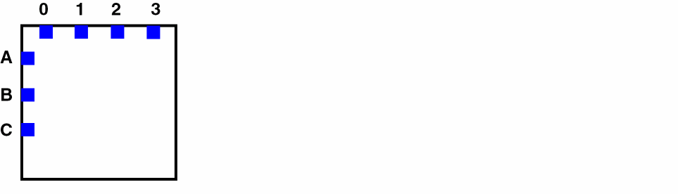
Space from CENTER pin uses the center pins on all edges. On the left edge in the example above, this is pin B. On the top edge, the pin spacer divides the total number of pins by 2 and uses the result as the reference pin (2).
Space from RIGHT/TOP pin uses the rightmost pin on the top and bottom edges (3) and the top pin on the side edges (A).
Place As In Schematic places the pins in the same relative positions as they have in the schematic view.
Iterated Pins lets you changed the way that iterated pins are listed.
Interleave interleaves the bits of the selected iterated pins, automatically applying an order constraint to specify how the individual bits will be placed.
Uninterleave reverses the interleaving of the selected iterated pin bits.
Expand shows all the individual bits of one or more iterated pins.
Collapse shows bus notation for one or more iterated pins.
All performs the Expand or Collapse function on all the pins in the list box.
Selected performs the Expand or Collapse function only on the selected pins.
Change Order lets you change the order of ordered pins in the pin table of the same layer.
Arrow left/down moves the selected pins down in the ordered list
Arrow right/up moves the selected pins up in the ordered list.
Swap order inverts the order of two selected pins in the list.
Create lets you create horizontal and vertical rail pins.
HRail elongates the selected pins horizontally from the left edge of the boundary to the right.
VRail elongates the selected pins vertically from the top edge of the boundary to the bottom.
Zoom lets you zoom the display in the canvas to the currently-selected pins. To enable the zoom functionality, click the Zoom ON button. This makes the slider active. You can then use the slider to set the desired zoom level. The acceptable zoom range is between 0 and 4. Level 0 provides the minimum zoom and level 4 provides the maximum zoom.
Alternatively, you can use the environment variable, vpaAutoZoomEnable, to enable the auto zoom functionality. This ensures that the zoom functionality is automatically enabled when you open the layout view. To set the desired zoom level, you can use the environment variable, vpaAutoZoomLevel.
Related Topics
Placement Planning
Use the Placement Planning form to define the boundary cells, tap cells, and rows to be generated before running the Custom Digital Placer.
Use the Boundary Cell tab to specify the information about the boundary cells to be placed around a set of rows.
Component Types specifies the component types that contain the boundary cells. Either type the component types or click Choose to select from a list.
Environment Variable: boundaryCellType
Cell Names specifies the names of the boundary cells. Either type the cell name or click Choose to select from a list.
Place Outside Region generates the boundary cells outside the row region.
Place On Top Of Row Cells lets you place standard cells over the boundary cells that are placed on the top and bottom rows. By default, the top and bottom rows, which contain boundary cells, are not usable for standard cells.
Left/Right Cells provides options to select the boundary cells to be inserted in the left and right edges.
Environment variables: leftBotCornerBdryCell, leftEdgeBdryCell, leftTopCornerBdryCell, rightBotCornerBdryCell, rightEdgeBdryCell, rightTopCornerBdryCell, leftBotEdgeBdryCell
Mirror indicates flipped orientation of the selected left and right cells.
Corner Cells provides options to select the boundary cells to be inserted in the Top, Bottom, Left, and Right corners of the selected placement region.
Mirror indicates that the selected top, bottom, left, and right cells are to be used with a flipped orientation.
Top/Bottom Cells provides options to select the boundary cells to be inserted in the Top and Bottom edges of the placement region.
Environment variables: topTapBdryCell, botTapBdryCell, topRowBdryCell, botRowBdryCell
Use the Tap Cell tab to specify the information about the tap cells to be inserted in the design.
Component Types specifies the component type that contains the tap cells to be used in the field. You can type the value or click Choose to select from a list. The specified component type must have the component class STDSUBCONT.
Environment variable: topTapBdryCell
Cell Names specifies the names of the tap cells. Either type the cell names or click Choose to select from a list.
Mode specifies whether the tap cells must be Static or Flexible. Environment variables: subContMaxSpacing, subContMinSpacing, substrateContactType
Static fixes the positions of tap cells as per the specified exact spacing values. Therefore, any change to the core cell placement does not affect the placement of the static tap cells. Specify the Tap to Tap Spacing and Tap to Tap Minimum Spacing values.
Flexible does not fix the positions of tap cells. Therefore, changes to core cell placement alter the tap cell placement. Use the Maximum Spacing and Minimum Spacing options to define a spacing range in the Flexible mode.
Pattern lets you select a pattern to place the tap cells. Options are: Regular and Checker Board.
Skip Row Count specifies the rows that must be skipped during tap cell placement. Environment variable: subContInAlternateRow
Offset from Row Start specifies the initial offset of the first tap cell in each row. This option is available only when Mode is set to Static.
Avoid Abutment specifies whether the tap cells must not be abutted vertically. Environment variable: avoidAbutment
Periodic inserts tap cells periodically from the list of available cells starting from bottom lower left. Environment variable: periodicTap
Lock Tap Cells applies the settings of Flexible tap cells and then locks the tap cells to their positions. Environment variable: lockTap
Use the Row tab to specify the information about the rows to be generated in the placement region.
Row Template lists all the row templates defined using the Row Template Manager. Select the row template based on which rows need to be generated in the layout canvas.
Use Partial Template allows use of partial row templates to fill the placement region. Environment Variable: usePartialTemplate
Vertical Grid and Horizontal Grid specify the reference grids (along each axis) for snapping the devices and rows during placement.
Vertical Offset and Horizontal Offset specify the offsets (along each axis) that need to be applied to rows after they are snapped to the reference grids (Ref X Grid and Ref Y Grid).
Number Of Rows is available only when you select a Row Template based on which rows need to be generated. You can either select Maximum to generate the maximum number of rows in the row region or Specify the number of rows to be generated within the region. Environment Variables: numRowOption, rowCount
Row Utilization specifies how much of a row is used by the components and how much is left free for routing. The default value is 100, which indicates that all available row space is reserved for placement of the components. Environment Variable: rowUtilization
Row Spacing specifies the spacing between the rows. To abut rows, specify the spacing as 0. If not specified, the spacing value is auto-computed by the tool. Environment Variables: row2RowSpacing, rowSpacingOption
Row Site Pitch is a non-zero value that indicates the minimum spacing between instances in each row. When specified, the value overrides the calculated value. Environment Variables: rowPitchOption, rowPitchValue
Row Site specifies whether the number of row sites should be calculated automatically (Auto) or whether the value needs to be rolled down to the nearest Odd or Even number. Environment Variable: numRowSites
Power/Ground Pattern specifies how power and ground rails alternate between rows. Environment Variable: supplyPattern
Generate Rails creates rails based on the power and ground rail specifications that you provide. Environment Variable: generateRails
Rail Position controls the position of rails relative to rows. The available values are: Inside, Outside, and Center.
Power Net (and Ground Net ) specifies the Net to which the rail belongs, the Layer on which the power (or ground) rail is drawn, and the Layer Width of the rail. Environment Variables: generateRails, supplyPosition, rowGroundLayer, rowGroundName, rowGroundWidth, rowPowerLayer, rowPowerName, rowPowerWidth
Use the options on the Create tab to define the generic settings.
Rows specifies whether rows must be generated.
Boundary Cells specifies whether boundary cells must be generated.
Tap Cells specifies whether tap cells must be inserted.
Boundary lets you choose whether the boundary for defining the region should be the PR boundary or a custom boundary defined in the design. Environment Variable: placeCluster
Placement Region lets you choose a shape for the placement region.
Rectangle creates a rectangular region.
Origin X sets the X coordinate of the lower-left corner of the lowest numbered row to be generated.
Origin Y sets the Y coordinate of the lower-left corner of the lowest numbered row to be generated.
Width specifies the width of the region. Make this greater than the height if you want to generate horizontal rows.
Height specifies the height of the region. Make this greater than the width if you want to generate vertical rows.
Rectilinear creates a rectilinear region.
Points specifies the coordinates that define the required rectilinear shape. Environment Variable: placementRegion
Draw lets you use the pointer to draw the required shape in the layout window. When creating a Rectangle, the shape you draw sets the placement region, and the X, Y, Width, and Height fields are filled with appropriate values. When creating a Rectilinear shape, the coordinates of the individual vertices are updated in the Points text field as you draw.
Update updates an existing region in the layout window.
Delete removes an existing region from the layout window.
Allow for Pins reserves a space equal to the size of the pin plus the spacing rule inside the boundary edge. This prevents rows from overlapping pins. This option is not available when you select a Row Template. Environment Variable: allowPins
Extend Boundary automatically expands the row and the PR boundary beyond the region, if needed. Specify whether rows are to be stretched Horizontally or Vertically.
Start from Lower Left lets you create rows from the lower-left side of the PR boundary or region. Use the X Offset and Y Offset fields to specify the corresponding row offset values.
Insert generates the specified components in the design canvas.
Delete deletes the specified components from the design canvas.
Related Topics
Custom Digital Placer Environment Variables
Swap Tap Cells
Use the Swap Tap Cells form to detect tap cells with maximum spacing violations and replace them with tap cells that have valid maximum spacing values.
Component Type lists all available component types that have their the component class set to STDSUBCONT.
Default Cell is the tap cell with which the existing tap cells in the design need to be replaced.
Maximum Diffusion Spacing is the spacing value against which the tap cells in the design need to be checked.
Choose Action includes the following options:
Check Only checks and reports maximum diffusion spacing violations in the current design.
Check and Replace replaces all tap cells in the design with the selected Default Cell; and then checks for maximum diffusion spacing violations are replaces erroneous tap cells with the alternate valid tap cells.
Run runs the Swap Tap Cells command.
Insert/Delete Filler Cells Form
Use the Insert/Delete Filler Cells form to either insert filler cells into a design or delete filler cells from a design.
Placement Region lets you define the region within which filler cells need to be added or deleted. Choose either prBoundary or any custom boundary defined in the design.
Mode section provides the following options:
Insert specifies that filler cells need to be inserted in the design.
Environment variable: insertFillers
Delete specifies that filler cells need to be deleted from the design.
Fillers section lets you define the following for the filler cells to be inserted or deleted. You can choose either one or both options.
Component Types specifies the component types that contain filler cells. Click Choose to display the Select Cells form.Select the required comptypes and libraries from a list. You can select multiple filler cell component types.
Environment variable: fillerCompTypes
Cell Names specifies the names of the cells that are configured as coreSpacer using the cellType attribute. Click Choose and select the cellviews from a list.
Environment variables: fillerCompTypes
Options section provides the following options:
Ignore Placement Blockages specifies whether blockages need to be ignored during filler cell creation.
Environment variable: ignoreBlockage
Physical Only specifies whether the physOnly attribute needs to be set for filler cells. For more information about this attribute, see physOnly.
Environment variable: createPhysOnlyFillers
For more information, see Inserting and Deleting Filler Cells.
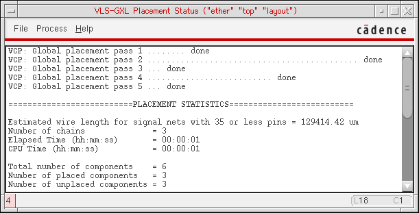
Placement Status
The Placement Status window reports the progress of the Auto Placer and presents detailed statistics on the results of the placement run. You display this window by checking the Show Placement Progress option in the Auto Placer form.
File menu lets you pick from the following functions:
Save As lets you save the log file under the name of your choice.
Search lets you search the log file for a specified string.
Close Window closes the Placement Status window.
Process menu lets you pause the placement run using the Stop Placer menu pick.
Related Topics
Return to top